Neu-velle
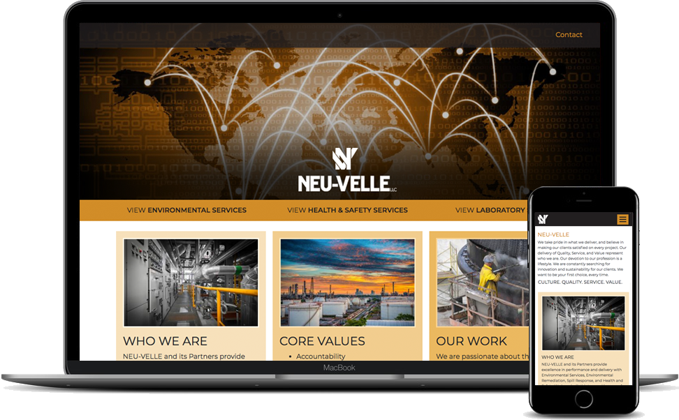
Neu-Velle had recently developed a brochure and wanted a website to compliment it. Their existing website wasn't mobile friendly, had a dated design, was slow to load, and wasn't flexible when managing content. Certain content seemed to end mid sentence because the words were hidden behind other sections of the design. We created a mobile friendly design for them built on a content management system that is easy to manage, looks great, and has excellent imagery to match the look and feel of their brochure.

Lucidity Networks
Lucidity Networks was unhappy with their previous website and approached us to create a new design, implement a new content management system and provide support for them. They are a local IT and Infrastructure firm in the Rochester, NY area and they needed a site that introduced themselves and showed off their services. Their approach stands out from the competition and they wanted their website to clearly show that.
We were given a design to implement but the design needed some tweaks and refinement. We created a separate design using some elements from the original along with the original color pallete and they loved it. We focused on usability, maintainability and consistency. The final product is a responsive design built in Craft CMS that is easy to maintain and looks great.

Gerber
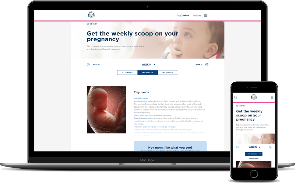
Gerber was looking for a way to display content for a new section of their website. Duo gives expectant mothers information about how her baby is developing and points out milestones along the way. This feature was implemented within Gerber’s existing instance of the Sitefinity CMS and it utilized web services to make for a great user experience. An admin section was created that allowed them to easily manage the content.
